Wednesday 25 May 2011

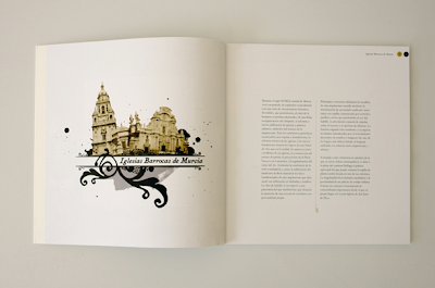
Iglesias Barrocas de Murcia Diseño editorial


the description were all in French but i recognise the ' editorial'


A 'nice' piece of simple illustrated editorial design.
I wasn't sure what it was for so its kind of hard to comment of whether the design solution is appropriate to the brief or not. However, I really like the use of simple layout and typography with an intricately drawn/ illustrated design which is also kept quite small but big enough you the audience to see the details.

I also lik the off white stock which i think looks really good with the design printed on it

minimal party posters


Audience and context:
function and purpose

Art direction & design poster for exclucive Magion minimal party with live djs. Every month in Fleda club Brno.


I really like the big bold type which is black used in contrast with the colour full background ( apart from the first one)

I also like how these work as a set and seeing that this is a party that occurs every month, the pormoters would be trying to get back the old target audience as well as bring in new ones.

By having these look like they are part of a set, their audience can immediately identify with the poster and know what the poster is about before they even read it.


Even for those who dont attend to these events on a regular basis, if these posters are put up around the same area once everyone, any body who regularly walks past the poster would recognise the,.

Visual Identity for KCR


Product:

Visual identity ( completed set with promotional material AND stationary)

I really like the simplicity of this design and the use of simple geometric shapes. I think that the colour theme works really nicely with the logo and these colours can be applied to a range of products/ promotional material in the future. The icon is minimalistic and simple.

I also really like the publication and how it follows the same theme with the triangular shapes and colours

as a whole product and range, I think this works really well

Antigone

product:

It is just a poster but they are still an effective way of communicating a message.
I really like the style of the poster and first you wouldn't really think its a poster promoting a greek tragedy but I think its a really nice idea to modernise the play.

if the aim is to attract a more diverse audience then this would be really effective


Antigone theatre poster for a classic greek tragedy.


Friday 20 May 2011

stationary set

grafixpol


FUNCTION/PURPOSE

I looked at this piece of Graphic design while I was researching for my leaflet for the Natural history Museum.

Although the folds themselves are quite simple I think that they have been used quote effectively.

The leaflet/ poster is multi purposed. It both provides the audience with the necessary information on the side of the leaflet and a piece of design on the side of the poster.

The fact the the poster folds down into a small leaflet with a matching front. I think that that is quite a nice touch. So you get a range of posters and that is identified through the front of the folded leaflet.

Other than the function , I also really like the design and the fact that it is quite simple

The m-house


FUNCTION AND PURPOSE
( possibly media / process too)
This is a hotdog fold posters. again I came across this as I was looking at different ways to fold a leaflet. We've come across this type of fold before in the first year and I am quite familiar with it.

I still think that it s a really effective way to fold a piece of information if needed be. This is because, with a hotdog fold , your eyes are guide through the pages really easier. The order of the pages are very much like a book and therefore a lot less confusing than all the other leaflet folds.

The only problem with this is that if you wanted to design a poster on the other side then there is a big slit through the middle of the paper.

This kinda design could be used for event promotion where a little information is needed and the space for distribution is unpredictable. With something that can be folded into such a small size, its easy to distribute them around the appointed area. They would easily fit into a booth, any sized stand etc.

leaflet


MEDIA/ PROCESS

this is a really nice piece of print and leaflet design. The folds are really really simple but I think with this kind of design it feels appropriate It also depends on the function of the design. I like the use of two contrasting colours ( black and bright orange). This means that it only needs to use two colours in the print process which is just black and one spot colour. However, this actually makes makes the leaflet look quite nicely done and expeinsive. The thick stock helps as well i guess.

The simple typography with the blakc and white photographs seem to work well together and I really like the grid-style layout of design.


calender


FUNCTION /PURPOSE:

this is a piece of calendar design and a concertina. I really love this design and idea of this calendar. The idea behind it is so simple but once printed on the right kind of media, it is so effective.

So, the purpose of this is obviously to be used as a calendar. It can easier be a hanging calendar or jus propped up in a desk 9 if you have the space). The layout and typography on it are really clear and thats what a calendar need really. The way that this has been done doesnt just look really good ( which it does) but it's also functional. The audience's eyes can be guided to the right month before looking at the writing through the colours. It is almost like a universal language that winter is blue and summer is yellow. The designer really utilized the use of colours into making this really lovely calendar


Subject/ or Specialist skills

I just really like this design. Its mostly typographic and just use of simple geometrical shapes. I've always been quite bad at using colours in my designs and I really like the use of colour in this one. What I like most about it is the fact that the designers have used traditional typefaces in a less conventional way and made them really exciting.

I only found this while I was looking for leaflet designs but I think the designs on each page might even work well as individual poster depending on its content and purpose.

Its hard to comment on the context of this as I'm dont know what this product is for and its not in english.....


A man's reach must exceed his grasp


Function and purpose:

I think this could be under funtion...... as i think this concertina is serving its purpose quite well.

As an audience it looks like the purpose of this piece of design is to send a message and get that strong message across the the audience effectively and I thinks that this piece of design as done a nice job in doing that.

The use of media ( concertina ) to suit the message is really clever. With this you dont really need to do much with the design. I think with this piece of Graphic, its the concept and the use of media to suit its purpose that is most important. Obviously the design is still important but you only need a simple helvetica writing to achieve this really

Bauhaus Leaflet


Wednesday 18 May 2011

need to be more like this...

Subject and content:

In general and I really like this style of design and I feel like this is where my designs are heading.

These are really simple posters with really love use of typography and a little bit of imagery.

They are all quite simple and definitely NOT busy. I see a lot of white space and neutral colours

Most of these posters also only use conventional typefaces which
is also another thing that I really like.

I love the use of traditional typography in design ( re applying old school typography)


Really nice use of Italitised typography. The text doesnt stand out that much with a bold illustration/shape on the back ground but with the light blue coloured tab, the text and the colour really cools the poster down. It also hides some of the boldness of the shape behind.

Again...Italicised text! I don't choose them on purpose. must just be a subconscience ting. Also nice use of clean typeface ( looks like century gothic on avant garde, i can never tell the difference) on a grungy back ground

This also seem to come up in my designs and designs I like quite a bit....some of the time they can be a bit cliche and tacky but sometimes, when used effectively, grunge backgrounds and add a real quality to a piece of design. especially when everything else on that design is nice and clean.

So simply, but I just like the colour and the big ". the hand written type ( or signature) also works nicely with the helvetica


black on a grunge background when used well also wins me over. I'm not sure why. I also think that on this , because the designer has added the bright yellow tab behind the texts , its really helped the design stand out.


again, really nice clean type but this time with a contrast of a hand written type. I think this, with the illustration works really nicely centrally aligned . I like the bold heading at the top with quite intricate text below


I really really like this typeface and this is what kind of inspired me into using the type I have used in my poster designs. I like the sans serif tall condensed type and the nice italicised serif type which is in red. Its really nice contrast that works well i think.


more type posters


Type posters